

Org dashboard
The Metrics page in the org sidebar is a dashboard over your deployment history. The numbers are exact — they come from real deployment records, not sampling.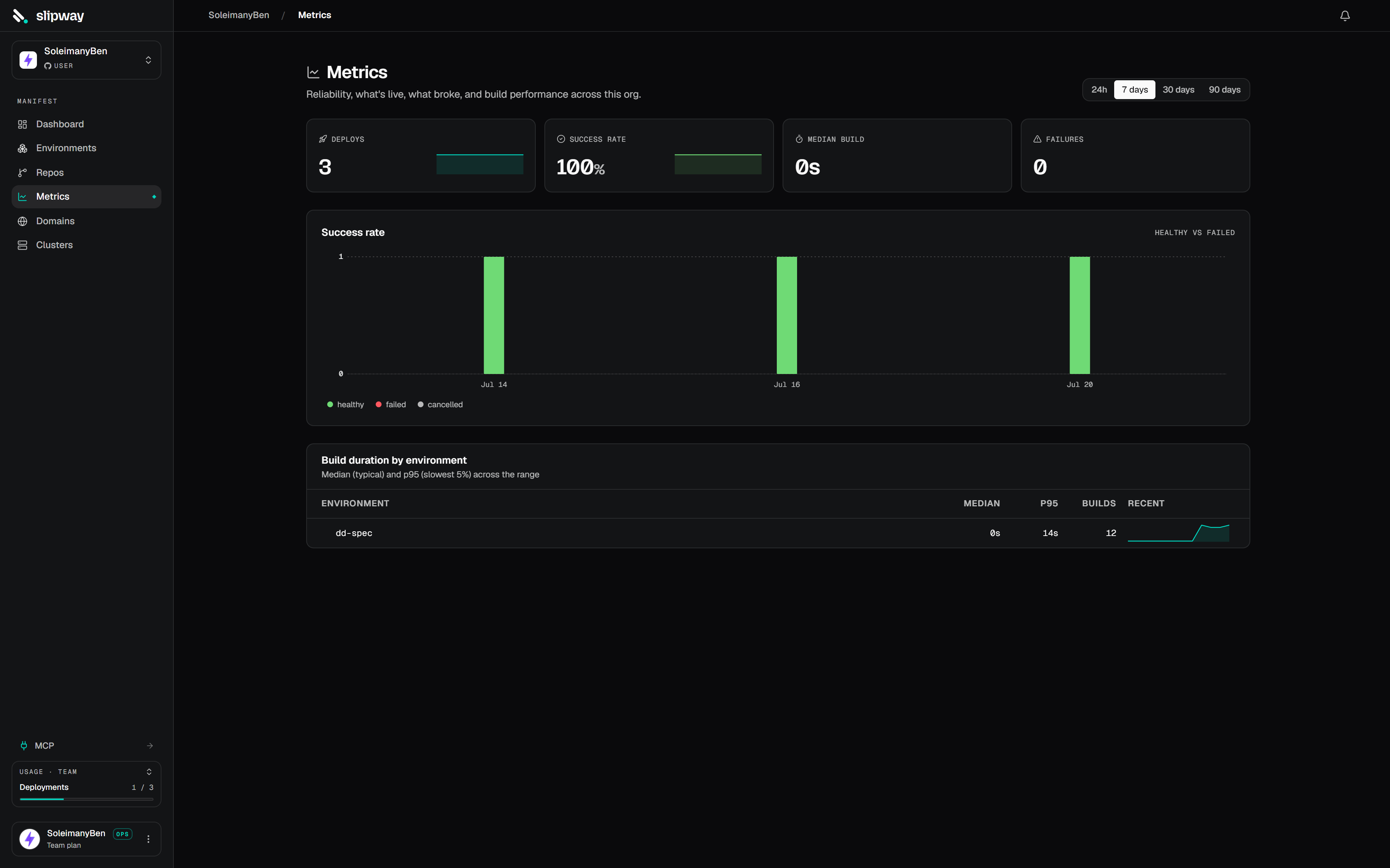
The org Metrics dashboard: deploys by trigger, success rate, failures, build times, top repos, and active previews.
Pick a window — 24 hours, 7 days, 30 days, or 90 days; all tiles share it. Only completed deployments count, so in-flight ones don’t appear in the success-rate or failure tiles until they finish.
Environment resource usage
Every environment’s detail page has a Metrics tab showing CPU, memory, and request throughput over time — a total line plus a breakdown per service (or per pod). Sampling is always on; the first points appear within a minute of a deploy, and 30 days of history are kept.- CPU is actual usage in millicores (1000m = 1 core), not the request or limit.
- Memory is the container working set.
- Requests is throughput at the public edge, split by status class (2xx–5xx), so a deploy that starts erroring is obvious at a glance. Service-to-service calls inside the environment don’t pass the edge and aren’t counted.
Environments on a cluster you bring yourself aren’t sampled — their Metrics tab is empty.