> ## Documentation Index
> Fetch the complete documentation index at: https://docs.slipway.sh/llms.txt
> Use this file to discover all available pages before exploring further.
# Metrics
> Deployment history across the org, and live resource usage per environment.
Slipway gives you two views of how things are running: an org-wide **Metrics** dashboard of deployment history, and a per-environment **Metrics** tab of live resource usage.
## Org dashboard
The **Metrics** page in the org sidebar is a dashboard over your deployment history. The numbers are exact — they come from real deployment records, not sampling.
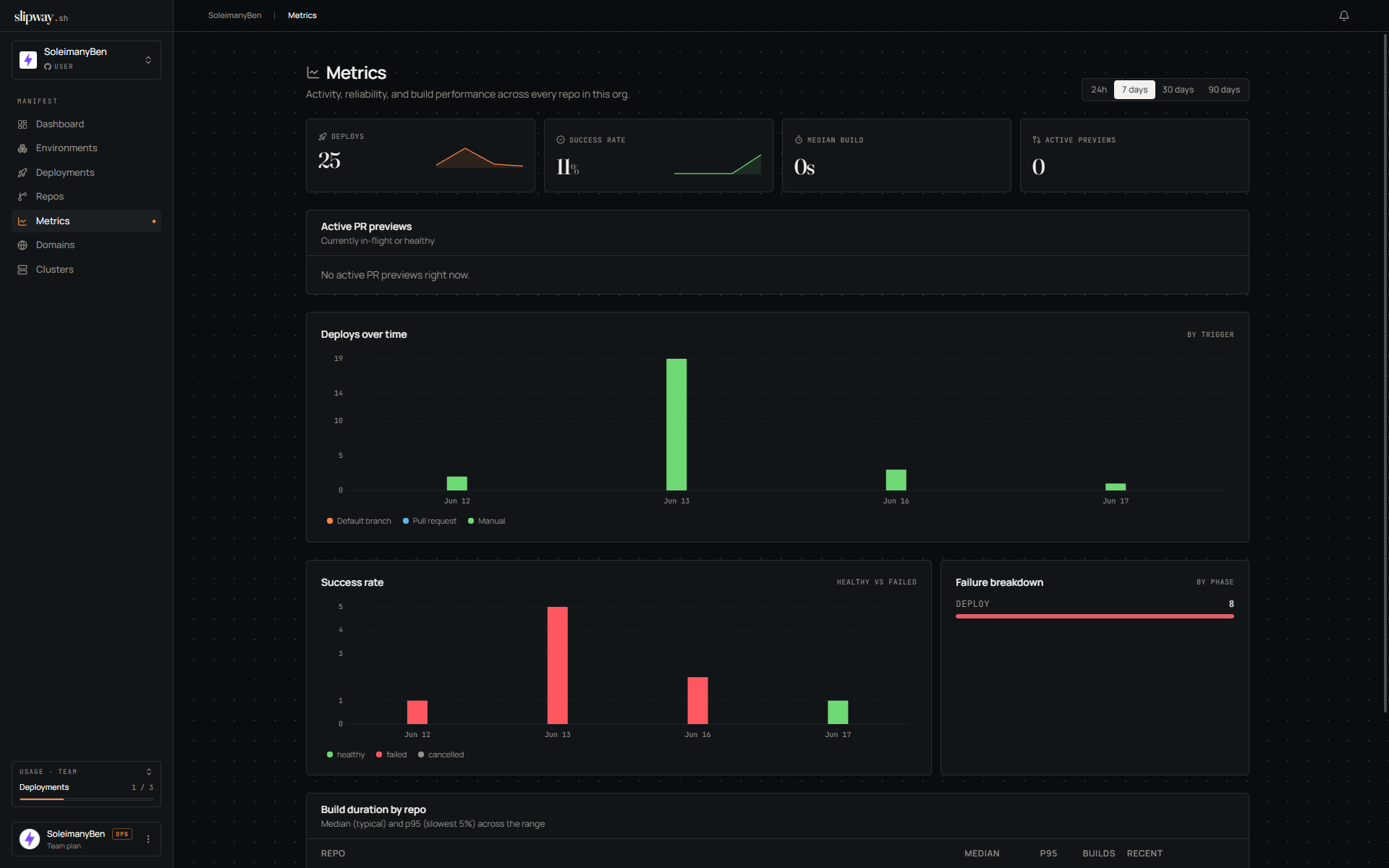 | Tile | Shows |
| -------------------------- | -------------------------------------------------------------------------------------------------------------- |
| **Deployments by trigger** | Counts split across push / pull request / manual. |
| **Success rate** | Share of deployments that reached `healthy`. |
| **Failure breakdown** | Failures grouped by the phase they happened in (build vs deploy). |
| **Build duration** | p50 / p90 / p99 build times per repo. A spike usually means a heavier base image. |
| **Top repos / authors** | Most active repos and GitHub authors. Authors are attributed from the commit, even if they've never signed in. |
| **Active previews** | How many deployments are currently healthy. |
Pick a window — 24 hours, 7 days, 30 days, or 90 days; all tiles share it. Only completed deployments count, so in-flight ones don't appear in the success-rate or failure tiles until they finish.
## Environment resource usage
Every environment's detail page has a **Metrics** tab showing CPU, memory, and request throughput over time — a total line plus a breakdown per service (or per pod). Sampling is always on; the first points appear within a minute of a deploy, and 30 days of history are kept.
* **CPU** is actual usage in millicores (1000m = 1 core), not the request or limit.
* **Memory** is the container working set.
* **Requests** is throughput at the public edge, split by status class (2xx–5xx), so a deploy that starts erroring is obvious at a glance. Service-to-service calls inside the environment don't pass the edge and aren't counted.
Switch the window between 1h / 24h / 7d / 30d; charts refresh every 30 seconds, and the table lists each group's average and peak. **By service** is the default and keeps a stable line across redeploys; **By pod** shows individual pods.
Environments on a [cluster you bring yourself](/clusters/byok) aren't sampled — their Metrics tab is empty.
| Tile | Shows |
| -------------------------- | -------------------------------------------------------------------------------------------------------------- |
| **Deployments by trigger** | Counts split across push / pull request / manual. |
| **Success rate** | Share of deployments that reached `healthy`. |
| **Failure breakdown** | Failures grouped by the phase they happened in (build vs deploy). |
| **Build duration** | p50 / p90 / p99 build times per repo. A spike usually means a heavier base image. |
| **Top repos / authors** | Most active repos and GitHub authors. Authors are attributed from the commit, even if they've never signed in. |
| **Active previews** | How many deployments are currently healthy. |
Pick a window — 24 hours, 7 days, 30 days, or 90 days; all tiles share it. Only completed deployments count, so in-flight ones don't appear in the success-rate or failure tiles until they finish.
## Environment resource usage
Every environment's detail page has a **Metrics** tab showing CPU, memory, and request throughput over time — a total line plus a breakdown per service (or per pod). Sampling is always on; the first points appear within a minute of a deploy, and 30 days of history are kept.
* **CPU** is actual usage in millicores (1000m = 1 core), not the request or limit.
* **Memory** is the container working set.
* **Requests** is throughput at the public edge, split by status class (2xx–5xx), so a deploy that starts erroring is obvious at a glance. Service-to-service calls inside the environment don't pass the edge and aren't counted.
Switch the window between 1h / 24h / 7d / 30d; charts refresh every 30 seconds, and the table lists each group's average and peak. **By service** is the default and keeps a stable line across redeploys; **By pod** shows individual pods.
Environments on a [cluster you bring yourself](/clusters/byok) aren't sampled — their Metrics tab is empty.